Digi-pack analysis
Every artist has their own digital pack/album cover that often has a photo of them with a captivating font and colour scheme. Similar to a poster, all of these features convey a meaning to the audience.
We've spent today's lesson analysing several digi packs from prominent artists, below are some examples of features used and what effect they expose to us.
The saturdays


- Typical Pop genre
- Targeted at girls - due to their clothing sense
- Male gaze
Change in colour as well as setting. It's clear that they're an establishing band
They're all posing & placed differently
Black&White shows maturity, more sophisticated
Tone is more serious & audience has matured


Westlife
Writing is formal - implies that the band are mature.
Bold colour senses that audience are targeted at predominantly males.
Placement of the Men suggests they're lost.
Clouds represent that sense of feminity
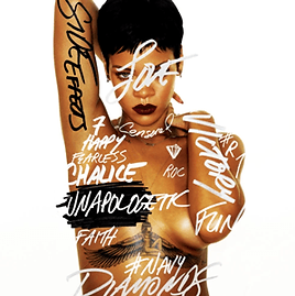

Rihanna
Red hair gives an edgy appearance.
Picture&colour connotes sexuality, lust.
Direct mode of address- Looking straight at the camera.
Name isn't included as she's already known. Her face sells to the audience.
Graffiti- Vandalism
-Shows her attitude towards her upcoming songs
Breaks stereotypical values of being an R&B artist due to her being too mainstream.
More edgy, cool and sleek
It takes considerably a lot of time to produce these types of digital packs. This video showing the making of Jay-Z's album, 'The Blueprint' is an example of how it's done.